CART: Cart is empty | Checkout
Bestsellers
-
$1.25
Orange Heavy Duty Fuel Line 1/4" ID
-
$1.25
Clear Fuel Line 1/4" ID
-
$1.25
Colored Fuel Line 1/4" ID
-
$1.30
OTK Kart Numbers
-
$2.40
Freeline Birel Fuel Line
Data Acquisition for Dummies (Like me!)
Category: Comet Technical Karting Blog
Posted: 09-03-2014 16:00
Synopsis:
Posted: 09-03-2014 16:00
Synopsis:
In this Karting Tech Blog we discuss a simple approach to data acquisition in karting.
|
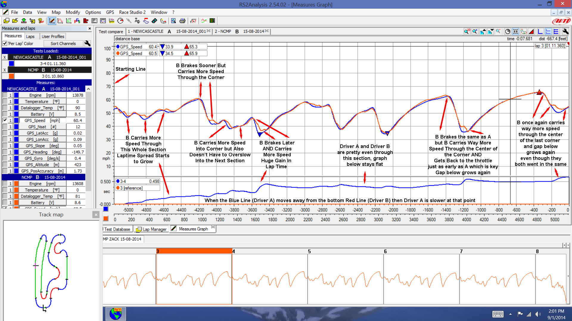
I remember the first time I showed up to the kart track with an onboard lap timer in the late 1990’s. I took a friend with me to the track to help start the kart and put it on the stand. He didn’t know much about karting and didn’t know how to work a stopwatch very well so the ability to get “live laptimes” in the kart was exciting! I put out my beacon for morning practice and within a couple laps I wasn’t get lap times anymore. Great, so much for technology. Well after I came off the track the club president was standing at the scales with my beacon. It turns out I brought Frankenstein to the track with me and the locals showed up with torches and pitch forks to run off the monster! Even though data acquisition has come a long way in acceptance since that time there is still a lot of confusion and ignorance on what data acquisition really is, how it can help you go faster and why you should be using it. The reality is you don’t need to know very much to learn a lot with data. I typically only need ONE graph to learn everything I need to know! It’s also much easier to pinpoint a bad corner or section of the track with a data graph than to attempt to stand by the track and watch the kart go around. Don’t get me wrong, watching the kart on track is important for the overall idea of what the kart is doing but when you are looking for a couple tenths it’s hard to see it on track most of the time. For the purpose of this article the data system used is the Mychron 4 Basic Gauge with a Mychron GPS unit. It's simple to install and the GPS can be moved between karts quickly if you want to log data on more than one kart but only have a single GPS unit. Ideally you want to overlay your data with someone faster. If you can download data from a quicker, more experienced competitor you can learn a lot. Basically all you need is two good laps to overlay and compare. I like to plot GPS speed versus the lap and then draw a track map using the Map link on the top of the Racestudio 2 Analysis. This makes it easy to know where on the track you are as you click around the graph. How to get to this point - Open Race Studio Analysis > Test Database (Select the first run you want to overlay) > Go back to the little folder icon on the top left icon bar to reopen the database and click on the other Test you want to overlay > hit Ctrl F2 to bring up the "Plot measures in a graph" > Go to Map at the top > New > Save the Map and if needed Load for Open Tests. You should have the graph looking pretty close to the one below. Now you just need to do a couple more things to really help your analysis. On the top RIGHT is another set of icons that help you change the graph characteristics. Click on the little icon with the double sided arrow "Snap ON/OFF" which will bring up a multi colored bar on the top of the graph (or turn it off, you want it visible) > then click the little pie shaped icon next to it to toggle the "time/distance", you want distance which will add the small graph at the bottom of the graph. The last icon that is helpful for me is the track map which is to the right of the double arrow icon. That will either show or hide the track map. You can also use function keys to open and close these options which is listed on there. Okay so now you should have the graph looking pretty much like this one below. I had to make the graph below pretty big so you can read the text, click on the picture to open a bigger file so you can read it properly. If the "measures" are not loaded on the far left on your graph then hit the space bar, it will toggle that window. The Blue Lap which is the slower lap is labeled A, the Red Lap which is the faster lap is Labeled B. In retrospec that probably should of been reversed but it took a while to make the graphic so I'm sticking with it!
As you can see on the graph it's pretty simple to pick out where you are losing time. You can see exactly where driver A is over slowing the kart, not carrying speed and what corners need the most attention. It's a lot easier to focus on the corners that actually need attention as opposed to telling the driver to just "go faster". Next session work on the areas where you need to improve and compare the data after the run and see if you are moving in the right direction. You can also use data analysis for chassis and engine changes, not just driver coaching. You can compare a gear change, axle change etc. and overlay the run before the change and after and see if you made any gains or if the adjustment was detrimental. I also like to use data when I'm testing to see if the track is changing or if the track is overall slower than the last time I ran there and it's not just me. Is data acquisition a panacea? Definitely not, but it's another tool in your arsenal. But like all tools you have to know how to use it for it to be useful. Race Studio offers many more graphs, histograms and data plots than I am demonstrating here and I'm sure a data guru could show you much more than I am. But for my money the simple "Plot Measures" graph is the quickest and easiest way to learn what you need to during a busy day at the kart track.
Mark Dismore Jr. |